
Thinking
8 Graphic design trends for 2021: Should you use them?
At the start of every year, we see a variety of design trends and predictions for the year ahead. Everyone makes their best guess as to what will be popular, and often, many of these well-informed predictions prove true.
But should you use them?
There’s really no fast and easy answer. What it comes down to is your brand.
We all know that consistency is a key component to build strong, lasting brands. If you’re always jumping on the latest trend, your brand is going to cease being recognizable. That’s why we’re sharing not only the design trends for 2021, but also how you can subtly infuse these elements appropriately into your brand.
Design elements inspired by nature
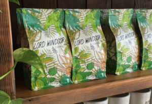
With the lack of traveling combined with the constant need to sanitize and sterilize our environments, people are craving the outdoors and nature. Although not as good as the real thing, the artificial infusion of nature into our world through graphic design will speak to those who miss the outdoors. Expect to see more and more nature imagery used throughout 2021.
Should you use it? Integrating nature imagery has to make sense from a conceptual standpoint. So, if it works for your brand or a specific campaign, go for it, but don’t force it.
Muted colors
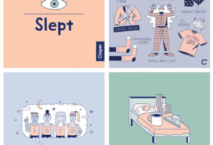
2020 was harsh, and color palettes have been as well over the last couple years. While bright, bold colors have been trendy in recent years, these color palettes can often feel over the top or artificial as we rarely see something quite so vibrant in nature. Expect more muted colors this year as we seek comfort in the aftermath of the pandemic.
Should you use it? It depends. Hopefully, your established brand has a color palette that includes some muted tones. If it doesn’t, consider re-evaluating your brand style guide before infusing a new palette.
Minimalism
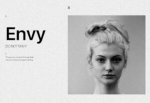
Flat and minimalistic designs have been chic for the past few years. However, the trend has had both positive and negative impacts. Minimalism allows designers to make readability a top priority. However, this focus on minimalism has caused designs as a whole to get more and more similar.
This lack of uniqueness can actually start to cause problems for usability, especially in digital environments. For example, many app icons now use the same shape or layout with flat colors. Meaning that instead of looking for an easily recognizable shape or color scheme, users have to search through a group full of extremely similar shapes and colors to find what they’re looking for. So, in 2021, expect to see a drift away from pure, flat minimalism as designers learn when and how to infuse uniqueness into their designs.
Should you use it? Our words of advice when it comes to minimalism are this: take the good, leave the bad. Focusing on readability and minimizing distracting elements is a good place to start. Just be careful not to make the mistake of oversimplifying and taking away from what makes your brand unique. While we’re not saying to clutter your designs, you should definitely find a way to make your design stand out from the crowd.
Duotones and gradients
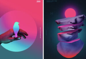 Gradients have been making a comeback recently, and 2021 will continue the trend. After being overused and becoming too complex to meld with the growing trend of flat and minimalistic design many years ago, designers are slowly working gradients back into their arsenal in more subtle ways. Expect to see duotone color palettes and gradients used in backgrounds or other ways this year – adding flair without being too distracting.
Should you use it? If you see an opportunity for gradients in your brand visuals, go for it! This is a great way to give your designs more depth and personality without going over the top or straying away from your brand’s style guide.
Blending realism and flat design
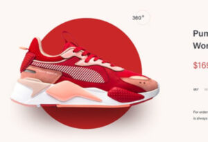 This trend has been growing in product and retail designs in recent years, and we expect that growth to continue through 2021. By blending realism and flat design, brands are able to add authenticity to designs while allowing them to stay simple at the same time – giving dimension to designs that may have otherwise felt too flat. Again, we see a slight deviation away from the popular flat design trend of previous years, but in a subtle and elegant way that allows designers to get the best of both worlds.
Should you use it? Yes, adding dimension in a stylish way is a great way to enhance your designed pieces.
Authenticity
 In 2020, we were all inundated with messaging that went something along the lines of, “In these unprecedented times, we’re here for you.”
And while these messages were coming from a good place, they often felt forced or cliché. This, along with a growing societal movement for more transparency, means you can expect 2021 to be the year of authenticity.
Brands will be expected to put their money where their mouth is and show exactly how they deliver on the promises they make. This, of course, will then be interpreted through a design lens as designers aim to use less stock photography and writers look to personalize their messaging.
Should you use it? Always! Your brand should always be authentic and transparent. Today’s savvy consumers can see right through trite-looking images and cliché messaging.
Text- and graphic-heavy designs
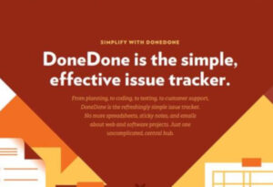 This is another trend that started in 2020 and will continue to grow in 2021 as a direct result of the pandemic. Safety guidelines have made capturing photography and film extremely difficult. While many brands were able to repurpose or reuse previously captured media, much of that media is either now becoming overused or does not represent our current socially distant and mask-wearing world. So, in 2021, expect text and graphics to play a larger role than usual as photography and film are becoming harder and harder to come by.
Should you use it? Use as needed. While we always prefer powerful imagery, there are plenty of ways to make text and graphics stand out when photo and video aren’t available.
Slide decks and carousel images
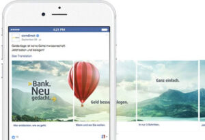 These alternate forms of content delivery fill a sweet spot between long videos and single images. In general, videos take longer to produce than images. And sometimes, there may be too much content to fit into a single image, yet not enough to justify creating a full video. The multiple image format of slide decks and carousels allow for large amounts of content to be produced and digested quickly and efficiently. Additionally, they have the benefit of being interactive, which can better engage the audience than a single image.
Should you use it? Absolutely. We love finding ways to deliver information in an engaging way, and this checks that box.
Navigating the latest design trends isn’t always easy. Need help staying on-brand or deciding which design trend you want to incorporate first this year? Drop us a line.

